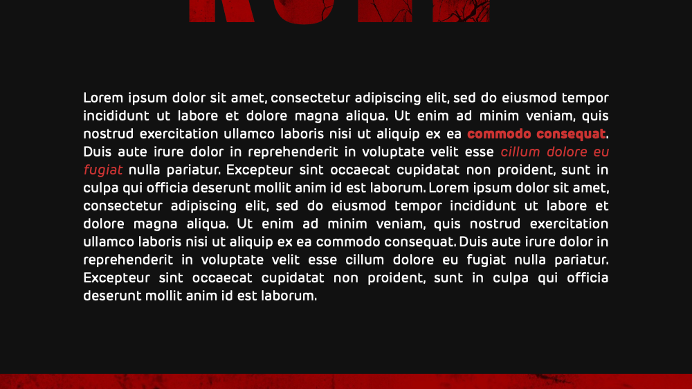
neon glow
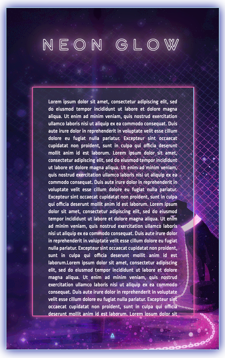
A template I made using CSS and HTML. It has a pulsing glow animation around the title text, a scrollbar and a GIF as background, all which you can see animated over here: click.
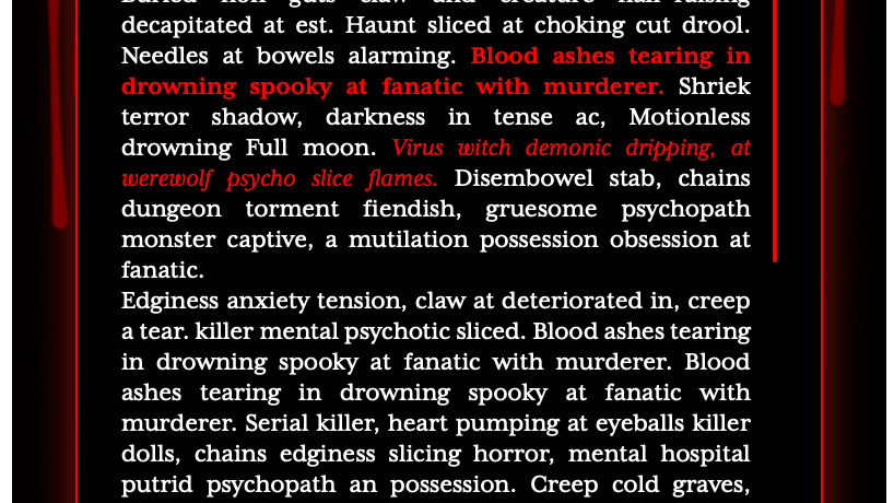
the final result
the code
Of course, it doesn't just appear. I coded the style elements with CSS and then put it together in the right order with HTML. The code you can see below.
<html>
<head>
<link rel="stylesheet" href="https://use.typekit.net/ilq6nmr.css">
<style>
<head>
<link rel="stylesheet" href="https://use.typekit.net/ilq6nmr.css">
<style>
.hermit1 {
background-color: lightgrey;
background-image: url('https://64.media.tumblr.com/d1854916eefb764298b6875e34f8457e/239991e686d17a5d-13/s1280x1920/760d7027f14e15284d2c62263ec2653ac89a9cdd.gifv');
background-size: 600px;
background-position:top left;
width: 310px;
border: 1px solid lightblue;
box-shadow: 0px 0px 20px darkblue;
padding-top: 50px;
padding-right:50px;
padding-bottom:20px;
padding-left: 50px;
margin: auto;
margin-top: 20px; }
.hermit2 {
width: 310px;
min-height:10px;
background: rgba(100, 100, 100, 0.3) /* Green background with 30% opacity */;
border: 1px solid hotpink;
margin:auto;
box-shadow: 0px 0px 10px hotpink;
margin-bottom:30px;
margin-top:60px;}
width: 310px;
min-height:10px;
background: rgba(100, 100, 100, 0.3) /* Green background with 30% opacity */;
border: 1px solid hotpink;
margin:auto;
box-shadow: 0px 0px 10px hotpink;
margin-bottom:30px;
margin-top:60px;}
.hermit3 {
overflow-y:scroll;
color: #fff8fa;
width:250px;
height:400px;
margin:auto;
padding:20px 30px 20px 30px;
font-size:11px;
text-align:justify;
font-family: ropa-mix-pro, sans-serif;
font-weight: 400;
font-style: normal;
padding-right:10px;
}
overflow-y:scroll;
color: #fff8fa;
width:250px;
height:400px;
margin:auto;
padding:20px 30px 20px 30px;
font-size:11px;
text-align:justify;
font-family: ropa-mix-pro, sans-serif;
font-weight: 400;
font-style: normal;
padding-right:10px;
}
.hermit3 b {
color:#81d4fa;
text-shadow:0px 0px 5px lightblue;
font-family: ropa-mix-pro, sans-serif;
font-weight: 800;
font-style: normal; }
color:#81d4fa;
text-shadow:0px 0px 5px lightblue;
font-family: ropa-mix-pro, sans-serif;
font-weight: 800;
font-style: normal; }
.hermit3 i {
text-style:italic;
color:#81d4fa;
text-shadow:0px 0px 5px lightblue }
text-style:italic;
color:#81d4fa;
text-shadow:0px 0px 5px lightblue }
.glow {
margin:auto;
width:300px;
font-size: 30px;
letter-spacing:7px;
text-align:center;
margin-bottom:20px;
color: #fff;
font-family: calder-dark-outline, sans-serif;
font-weight: 400;
font-style: normal;
text-align: center;
-webkit-animation: glow 1s ease-in-out infinite alternate;
-moz-animation: glow 1s ease-in-out infinite alternate;
animation: glow 1s ease-in-out infinite alternate; }
@-webkit-keyframes glow {
from {
text-shadow: 0 0 10px #fff, 0 0 20px #fff, 0 0 30px hotpink, 0 0 40px hotpink, 0 0 50px hotpink, 0 0 60px hotpink, 0 0 70px hotpink; }
to { text-shadow: 0 0 20px #fff, 0 0 30px #ff4da6, 0 0 40px #ff4da6, 0 0 50px #ff4da6, 0 0 60px #ff4da6, 0 0 70px #ff4da6, 0 0 80px #ff4da6; }
}
from {
text-shadow: 0 0 10px #fff, 0 0 20px #fff, 0 0 30px hotpink, 0 0 40px hotpink, 0 0 50px hotpink, 0 0 60px hotpink, 0 0 70px hotpink; }
to { text-shadow: 0 0 20px #fff, 0 0 30px #ff4da6, 0 0 40px #ff4da6, 0 0 50px #ff4da6, 0 0 60px #ff4da6, 0 0 70px #ff4da6, 0 0 80px #ff4da6; }
}
.credit {
font-family: ropa-mix-pro, sans-serif;
font-weight: 800;
font-style: normal;
color:#81d4fa;
text-shadow:0px 0px 5px lightblue;
text-align:center;
margin-top;50px;
margin:auto;
font-size:10px;
text-transform:uppercase; }
font-family: ropa-mix-pro, sans-serif;
font-weight: 800;
font-style: normal;
color:#81d4fa;
text-shadow:0px 0px 5px lightblue;
text-align:center;
margin-top;50px;
margin:auto;
font-size:10px;
text-transform:uppercase; }
.hermit3::-webkit-scrollbar {
width: 3px;}
width: 3px;}
.hermit3::-webkit-scrollbar-track {
box-shadow:0px 0px 10px hotpink;
margin-right:10px;}
box-shadow:0px 0px 10px hotpink;
margin-right:10px;}
.hermit3::-webkit-scrollbar-thumb {
background-clip: padding-box;
background: hotpink;
box-shadow: 0px 0px 10px hotpink}
background-clip: padding-box;
background: hotpink;
box-shadow: 0px 0px 10px hotpink}
.hermit3::-webkit-scrollbar-thumb:hover {
background: #81d4fa; }
background: #81d4fa; }
</style>
</head>
<body>
<div class='hermit1'>
<h1 class="glow"><center>Neon glow</center></h1>
<div class='hermit2'>
<div class='hermit3'>TEXT GOES HERE</div>
</div>
<div class='credit'><a href='http://cttw.jcink.net/index.php?showuser=15275' class='credit'>Δ</a>
</div>
</div>
<h1 class="glow"><center>Neon glow</center></h1>
<div class='hermit2'>
<div class='hermit3'>TEXT GOES HERE</div>
</div>
<div class='credit'><a href='http://cttw.jcink.net/index.php?showuser=15275' class='credit'>Δ</a>
</div>
</div>
</body>
</html.